
Web Services
MacCetera Design Portfolio Archive
Nothing is forever... including web sites.

2007 Excellence in X-ray Diffraction Bruker AXS Scholarship
Angie Grossen, project manager,
Bruker AXS–US, Madison, WI
Year: 2006, commercial
Tech: HTML, CSS, PHP
Objective: present a web-rendered version of elements from the client's scholarship brochure to be
Details: single page design (application/form) with two supporting pages (input error correction and confirmation/thank you) and custom PHP code to process the form, handle errors, and send confirmation and application submission e-mail to the applicant and client.
Additionally, we facilitated development of a coordinated print/PDF application form.
Notes: we delivered this project on schedule for the Bruker AXS US office, but their IT department in Germany chose to implement their own design...
...they did use the our PDF version of the scholarship application form if that counts.
view the amazing and almost fully-functional site demo in our archive
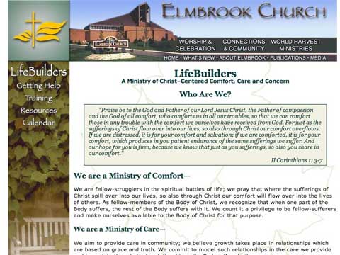
Elmbrook Church LifeBuilders Ministry
Skip Smeiska, project co-developer
Waukesha, WI
Year: 2004, pro bono
Tech: HTML, CSS, JavaScript, PHP, Contribute ready.
Overview: present an improved, church branded appearance, styled to coordinate with ministry print brochure.
Details: LifeBuilders is an umbrella ministry for several related support groups. The basic design allowed it to be leveraged for other unrelated ministries This presented an interesting navigation challenge we solved with a 3-tier layout:
- Church: the header area holding church-centric links,
- Ministry: the left sidebar containing ministry common links, and
- Sub-group: specific links in the top content area of the sub sections within each ministry.
Emphasizing the "cascade" philosophy of CSS, the Church-common/Ministry-common hierarchy was accomplished with a shared design that included automatic print format output and interesting design elements.
Notes: this design served LifeBuilders for over two years before the church gathered all the independent ministry sites under a single, unified site.
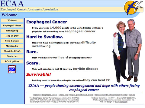
Esophageal Cancer Awareness Association
Year: 2002, pro bono
Tech: HTML, CSS, PHP, Contribute ready.
Overview: Provide a web presence for the fledgling organization.
Details: While serving on the Board of Directors for this new 501(c)(3) organization, Marc developed their first web site. The maintenance of the site was turned over to the current BoD in 2005 when Marc's term expired. This design remained virtually unchanged until it was retired in mid-2007.
While the current site is online at ecaware.org, it retains virtually none of the design elements of the original 2002 save the "Swallows" logo, which was developed by the ECAA's first President, James Gillett. PhD.
By today's standards, this design is a bit rough, but it did employ automatic print styles through CSS and had an otherwise simple and clean liquid layout.
To Russ and Dennis - both are missed... and to Connie, James, Judith, Richard and Tammy - who tried to accomplish something against all odds.
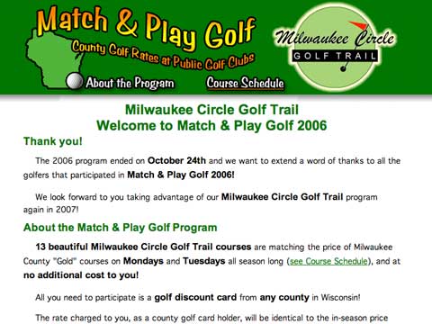
Match & Play Golf
Mark Krause, Muskego lakes Golf Club
Muskego, WI
Year: 2005
Tech: HTML, CSS, Javascript
Overview: promote local private golf clubs to golfers that predominantly play at tax-subsidized, county-run golf courses.
Details: a project for members of the Milwaukee Circle Golf Trail, the Match & Play program ran through the 2005 through 2007 Wisconsin golf seasons.
This was an embarassingly simple, task specific site consisting of a mere two pages: the main About page with the general program information, and a Schedule page that listed course participation dates. The latter was set for automatic "pretty" printing through CSS media control.
Notes: The program was discontinued in 2008.
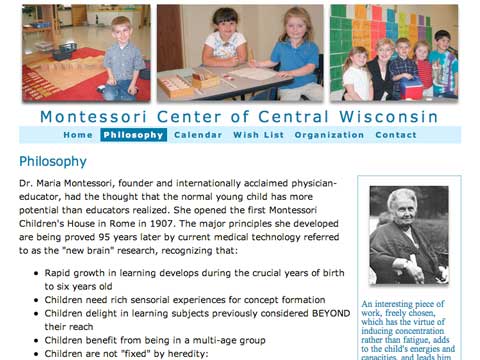
Montessori Center of Central Wisconsin
Paul Sandvik, project co-developer
Wisconsin Rapids, WI
Year: 2005, pro bono
Tech: HTML, CSS, JavaScript, PHP, Contribute ready.
Overview: present an appealing site to better present this small Montessori school.
Details: with zero-budget for a web redesign, Paul came down for an intense weekend session to clean up their existing site. This simple total makeover was the result.
We rescued 6 pictures from the original site and used them in three-spot header layout. Three are picked at random with a simple bit of javascript, and make the site appear fresh with minimal resources.
This site also included automatic print format output and (with no humility on our part) an amazing presentation that proves that simple can also be elegant and effective.
Notes: this site was taken offline as the school began to close its doors for good... a result of the local economy in an area where downsizing paper mills are the top of the food chain.
view the first two pages of this simply effective design in our archive
Copyright © 2003-2008 by MacCetera, a Wisconsin LLC owned by Marc & Tammy Wolfgram
Mac OS, Macintosh, and other like terms are all trademarks of Apple, Inc. -
25-Oct-2009

